Wednesday, July 30, 2008

Focusing on Food Ads

Despite the almost endless natural and unnatural afflictions that occur in California.....fires, winter floods, chronic water shortages, occasional major earthquakes, over-crowded cities and freeways....this state was, and still is, a mega agricultural and food producer. The CAWS will focus on food ads this week....not for the last time!


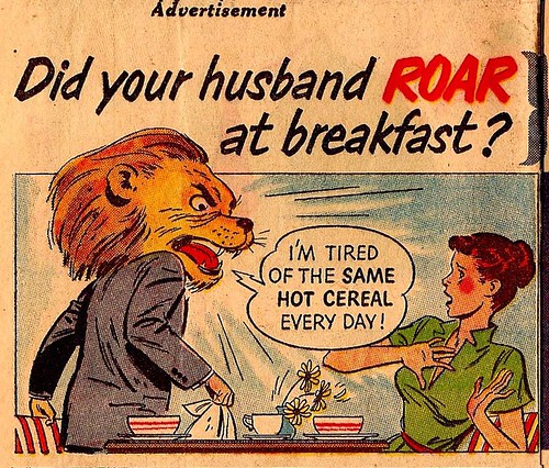
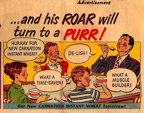
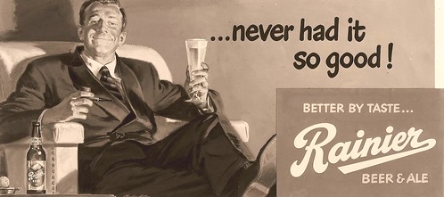
San Francisco had it's share of large food and beverage corporations, and their ad agencies. I'll start with Safeway, the giant food retailer, based across the bay in Oakland.

Safeway has, and had, a bunch of 'house brands'....and this example below was one of the 'Bel Aire' frozen foods ads from the mid 50's. Working from the ad agency's rough layout, I asked the age of the kids sipping lemonade. The Safeway ad manager over in Oakland said...'about 13'. Luckily, my wife taught a junior high Sunday school class....and she recruited two charming 13 year-olds to model. I took the photos separately...easier to pose and better lighting.


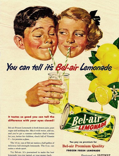
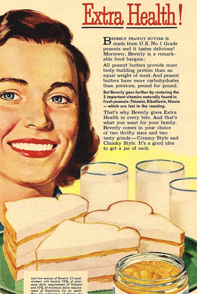
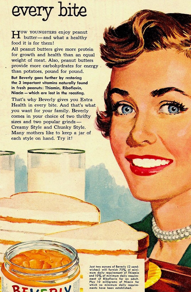
When the job was delivered, the Safeway ad manager complained that the kids were 'too old!' When all the facts were relayed....now, get ready for a 'small world' classic....it turned out he belonged to the same large suburban church that we did....and, he was the current head of the Sunday school department! Suddenly, the illustration got a whole lot better! Another sign of approval.....I received several more Safeway ads that year....examples, the two 'peanut butter moms' included at top and below.


Del Monte was one of the major food producers located in San Francisco....and a prolific ad producer as well.


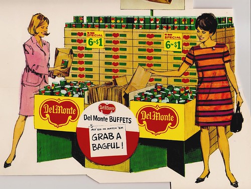
Most were 'trade ads', not all that popular with the illustrators. Main reason, most portrayed scads of Del Monte cans and their infamous logo....called 'the Bug'. A couple of examples here....the cans and the box ends and all the lettering involved the Bug, and had to be illustrated.


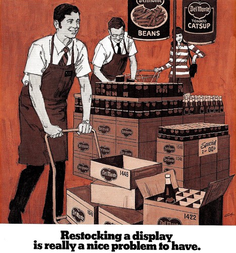
Not my favorite way to spend a work day!

Be sure to check out the large size versions of these pieces in Charlie Allen's Flickr set.

Tuesday, July 22, 2008

Back in Black... and White

We're back to black and white line ads on the CAWS....real color next week. B&W line illustration was truly the staple ad assignment in the 40's and 50's in San Francisco, with B&W halftone a distant second. The 60's and 70's saw more use of full color and duotone reproduction....and both drawing and painting styles had changed by then.


B&W illustration in daily and weekly periodicals dates back before the turn of the 20th century with such outstanding talents as Charles Dana Gibson, James Montgomery Flagg, Howard Pyle, and many more. I was very lucky to get in on the last years of brush and ink and pen and ink use in advertising art. And, as said before, San Francisco was the epicenter of both the style and the demand....by a bunch of agencies and corporations.


Also, S.F. produced a talented group of illustrators who used and mastered the technique. B&W illustration was not taught at the art schools....it had zero recognition during my one year at the Art Center School in L.A. I had done dozens of small B&W line ads at the Thomas Ad Agency in Fresno and during my year at the Fresno Bee newspaper....so, had a bit of a head start when I got to San Francisco.


Four scans on this....from monthly PG&E consumer ads in the early 50's, promoting power use and new appliances. (Notice the power prices on a couple of these....WOW!) I enjoyed doing the Fresno Court House scene....almost knew the trees from memory!


Last scan....in case of doubt about the effectiveness and strength of B&W advertising.....here's....


* To see the full size versions of these illustrations got to Charlie Allen's Flickr set.

Monday, July 14, 2008

Illustration & Cartooning: "Joined at the hip"

The CAWS will detour a bit... and hop-scotch over a few decades. Maybe a sort of 'the head of a pin' discussion... that I've had with Leif in recent months. Subject, illustration vs. cartooning.


My feeling, they're joined at the hip, or very close relatives. Both use exaggeration, distortion, humor, drama, emotion....the gamut of real life experiences, in a graphic form. The interpretations of these are endlessly varied, as are the creative artists who produce them. Cartoonists use realism, and illustrators use cartooning. Hal Foster and Milton Caniff were really B&W illustrators. Norman Rockwell often cartooned his figures on a Post cover. Think back to the marvelous characters created by N.C. Wyeth in 'Treasure Island'. He created them from his skill and imagination. Were they illustration, or were they cartooned....or both?


Fortunately, I could swing both ways, although San Francisco was not not a large source for cartooning. I'll include four scans on this... the first a comic section ad for Carnation (above), done in the 50's. Drawing, no models.

The second, a 1960's Chevron billboard...


...I used models, including the Mastiff, on all three....but the expressions were cartooned. The third was a Gallo P.O.S. store poster from the 70's...


...no model for the hayseed character. I'll call it illustrative cartooning.

The last were a couple of safety poster comps, done in the 70's, for a mid-west client. They were silk screened in three colors and illuminated, for factory locations.


Notice the client changed my captions... but the designs were OK. Cartoons or illustrations?

* Check out Charlie's Flickr set for the full size versions of these (and many other) illustrations.

Tuesday, July 8, 2008

"Every billboard was an enjoyable challenge"

CAWS number two, I've included my second and third billboards (in the trade, 24 sheet and 30 sheet posters)..... done in 1949 and early 1950.


Won't continue with billboards....or with the early sequence of illustration jobs....but the first several years were important in establishing a name and reputation, both in San Francisco and even in the East.


Again, on these, I sweated them out....but finally after several were accomplished, a billboard became like any important job that came in. Every one, in fact, was a challenge, but unless too pushed by deadlines, rewarding and enjoyable.

The model for the poker player was our excellent lettering artist (lettered most of my billboards) and all around 'everyman' model. Jim Hasse, by name....he was the dad on the phone (and on the hook!), for the heating oil B&W ad.


Will include an early PG&E line ad with this....the beginning of a long series for that company....way back when the power companies, unlike today, were selling mighty hard on power use, new appliances, the 'good life' for young post-war families!


*You can see full size versions of all these illustrations (and many more) in Charlie Allen's Flickr set.

Tuesday, July 1, 2008

"To put it mildly, I sweated bullets"

First of 'the CAWS'. Both these were 'breakthrough' jobs.

The B&W was done in 1949, about a year after I arrived. Standard Oil had not even become Chevron at that time.


I still recall Chet Patterson coming in, chortling over the job, having sold Zim (Carleton Zimmer, head AD at BBD&O) on trying his new young artist on an important, first line, newspaper ad. Chet knew he had Bomberger, Galli, and Haines Hall to back up...


...and his zeal and benevolence was motivated by more than advancing my young career. I was still on a modest salary....the others would take a much larger chunk of the profit! Chet's admonition, 'Don't screw it up, Charlie' wasn't all that much help... but I knew it was a major step up. I also recall saying, 'Hey, I'll need models and good reference shots'. It was the first time I could request 'first cabin' treatment as a young artist!

The same story pretty much applied to the billboard job, which came along about the same time. I don't recall the agency involved.


To put it mildly, I sweated bullets on both assignments....remember planning them in my sleep! I really didn't have the background experience for these....but just gave them my best at the time.


Enough history.....these scans won't always have a long song and dance with them!