Wednesday, October 29, 2008

'MARTHA! THIS IS THE BIG ONE!'

San Francisco has always had plenty of entertainment....from fine opera, ballet, and symphony companies, theatre and musical comedy performances, down to the bawdiest of North Beach night clubs. But...as an entertainment capital....S.F. was not. The television and movie industries were in Los Angeles and Hollywood....as well as the advertising and promotions for both that were created there.

Still, occasional 'show biz' related assignments and stories came my way. This week's CAWS will show a few.

Redd Fox, with one of his oft feigned heart attacks on the entertaining sitcom, 'Sanford and Son', back in the 70's. His flexible face and expressions were a pleasure to draw!


Allen151
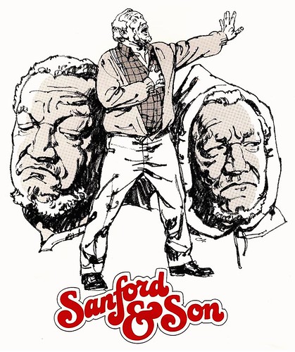
The 'Sanford' montage, and the actors heads, were done with what became my favorite tool in the 70's....plain General charcoal pencils, 2B to 6B.

Allen152
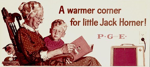
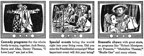
'That's Entertainment' was the original idea on this piece: a PG&E newspaper TV ad with two inch spots...proving a lot can be shown in a small space.

Allen154
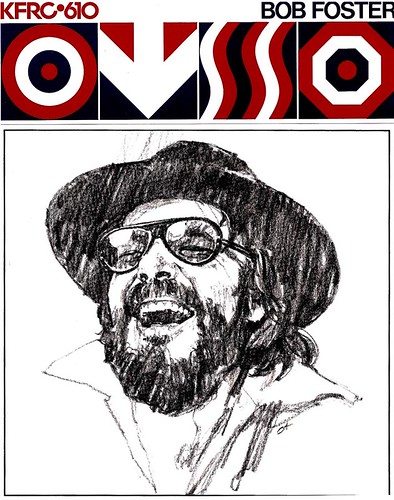
Next scans, three 1960's KFRC radio disc jockey promos....'hippie era' stuff...and my adaptation to it.

Allen149

Allen153
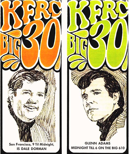
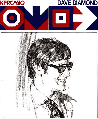
One, a scruffy technique on a scruffy DJ!

Allen150
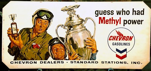
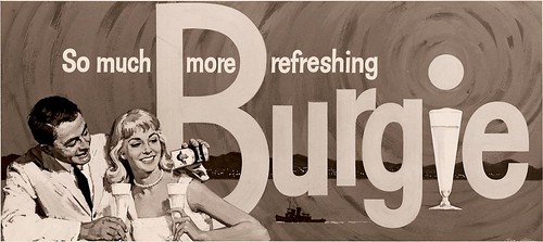
Also, an 8" x 10" B&W copy of a Burgie billboard....I think early 60's. We brought in a couple of models from one of the agencies in town....the young guy just bursting with energy, pep and go. His name was Bill Bixby....and I had a hunch he wouldn't be around long. Obviously, he went on to a long TV series and career in Hollywood.

Allen155
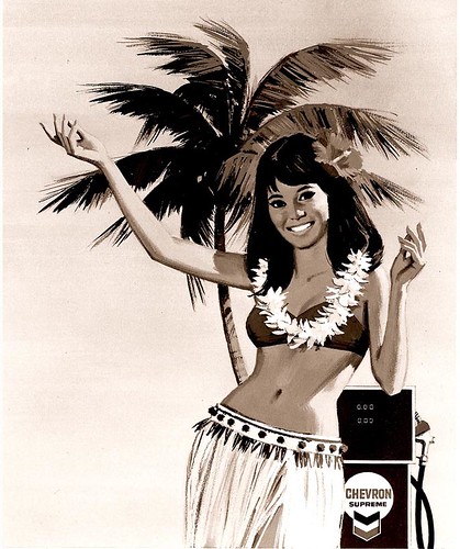
Finally, the 'Chevron Island' hula dancer, tied in with their TV ads at the time.

Allen156
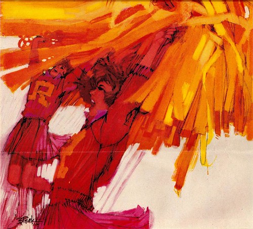
The last image on 'show biz' will have to be in the viewer's eye... and we'll liberate a fine Bob Peak cheer-girls 7up illustration to set the scene...

Peak47

On a crisp fall morning in the 70's, I delivered a job to P&H in S.F. Walking in, was 'shhhh-ed' at the door by the receptionist. "They're video taping!" P&H had added a service called the 'Film Works' in the 60's...film/photo/video/documentary stuff. I walked quietly up carpeted stairs to Chet Patterson's office....which had a glass wall looking down on the photo studio. For some corporate client....and to lights, action, and camera....a cute blond cheerleader was going through her act. Practiced moves, white outfit and shoes, with big red pom-poms....just one thing was missing....her top! A few seconds later, the final big leap, arms and pom-poms high in the air....for a brief instant, all defied gravity! I turned to Chet....'Wow....the Film Works has all the fun jobs....who's the model?' He said, 'She's from San Mateo....her name is Suzanne Sommers'. As we know, Suzanne went on to a successful career on the sitcom, 'Three's Company', as well as other venues in Hollywood. Still active in business, and looks great.

*Charlie Allen's Flickr set.

Tuesday, October 21, 2008

LEFT IN SPACE!

No....not the astronaut on an early spacewalk back in 1965. He returned in fine shape. I did not!


This Telephone illustration was on my drawing board at the time, the upper sky and astronaut 95% completed. My youngest daughter and I went over to a nearby grassy hillside where her horse was pastured. Supplemental oats were needed at that late summer time of year. Will skip the sad details, and my lack of 'horse sense', but I ended up on the ground with a right forearm broken in two places. Fortunately, the lightning fast kick hit between my elbow and wrist....either of those blows could have been a career ending event!

The two breaks were set, a heavy plaster cast, hand to upper arm, plus sling, installed. Then....what to do? Decided to finish the lower half of the illustration left handed....hence....'left in space!' It took three days to finish what should have been a half day's work. Please try working with the 'wrong' hand sometime....it's just sheer torture! The ad was completed, a tad late...followed by four months of 'early retirement', plus several weeks of rehab, before returning to working efficiency. At the time I was overloaded with work....and over stressed. Maybe a good thing!


To stay with a theme, will include a few other space subjects, very much in the news in those days....the 50's and 60's.


The first three, Telephone News mailers, once again.


Then, the scientist stepping into space, for National Oil Seals....and I still get a bit of vertigo when I see it occasionally.


Finally, a NASA subject showing early space and satellite efforts for Vought Aircraft, down Texas way.


* All of these images can be seen at full size in Charlie Allen's Flickr set.

Tuesday, October 14, 2008

TAXI!

For a change, CAWS 16 will stay with a theme...last week's 'taxi boards'. The usual attempt is to vary subjects to avoid the boredom thing as much as possible. Coming from one source and advertising art from one market, not easy!


'Taxi boards' were 2 x 3 foot heavy cardboard weather-proofed posters mounted in a metal frame on the backs of San Francisco Yellow Cabs. Can't recall whether they were displayed in other cities in California, or elsewhere. On the first, the race car winners, I used two neighbors as models. One a stock broker, the other a high school teacher, but good sports both. They were not that different in size! Sport car racing was a popular fad in the 1950's....now racing seems all NASCAR oriented.

Then...the wind streaked convertible couple... good rendering but classic shallow advertising.


I swallowed my pride about content early... going in. Wanted to earn decent money and support a family. I suppose we all compromise in our work lives... but hey, no complaints!

Next, the '20/20 vision' Chevron service station attendant. I don't recall ever receiving that service in the old days!


My contribution....the 'looks' on the couple in the car. He looks a bit skeptical...jealous?...whatever. She looks pleased...even admiring. Too subtle, I'm sure.

Then....the cool hand filling the radiator....and, yes, children....radiators did fill that way back in the 50's!


Finally, the 'busy car gasolines'....and, you guessed....I'm the briefcase commuter!


All of these were reproductions of Chevron billboards...obviously advertising that Chevron and the Yellow Cab Co. thought valuable and profitable. Back in August I remembered a stash of about a dozen of those and other posters too large for a proof drawer. Out of sight between a metal file and studio wall, I hadn't looked at them for years. I propped a few against the back of a patio chair and took shots with my Pentax. Considering their age (about 50 years), original reproduction limits, and my camera distortion, the color fidelity and results are better than I expected.

* See these images at full size in Charlie Allen's Flickr set.

Tuesday, October 7, 2008

BILLBOARDS: ART...EYESORES...BOTH?

As a youngster in high school, I enjoyed looking at billboards. Recall trying to imitate the technique on the 'Double Your Pleasure" Wrigley gum ads....without much success. Those were Americanized versions of European poster art....and I doubt if I knew what an airbrush was. Much later as an illustrator, I had a vested interest in what were called 24 and 30 sheet posters....and I completed dozens of them. They were choice jobs to receive, and paid a lot of bills for my growing family!


Above, a Bank of America billboard, 'Rainy Day Money'....and today we probably still need it!

When the 'big change' happened in the late 60's, it happened suddenly. Billboards WERE an eyesore....cluttering up streets, buildings, and highways in the open countryside. It was time for them to go. Once again, my mantra, 'change is the constant'....but the change greatly affected illustrators, and certainly affected my sources of work and income. Well....cest la vie!


* Seen before: the 'windshield wipers' poster above (on which my neighbors were the models). One earlier comment on Flickr had said they looked like the same guy....but actually, only one repeat! Which two? Answer at the bottom....

Below, a faded color print (and my only record) of probably my favorite poster from the late 50's. The grandmother's dress was originally blue-violet....now, flesh tones are faded, heater and other colors gone, although the drawing and values still hold up fairly well.


This PG&E board received the 2nd 'Max Schmidt' annual award for best poster in the western states that I had won. The earlier winner was another PG&E poster, again with an electric heater, with red-orange Dayglo fluorescent ink silkscreened in the center....amazingly real in appearance.

Also included is an 8 x 10 inch B&W copy print of a 1960's 'Burgie' billboard.


Definitely not a Whitcomb or Whitmore romantic story illustrator....but I'm still pleased with the gouache handling on this poster.

Finally, the 'toothache mastiff' once again, which shows the approximate colors. This and the 'windshield wipers' poster near the top were 'taxi boards'....24 x 36 inch Chevron posters mounted on the backs of San Francisco Yellow Cab taxis...


...more on those later.

* See these images at full size in Charlie Allen's Flickr set.

* A: The two attendants in the middle!