
B&W illustration in daily and weekly periodicals dates back before the turn of the 20th century with such outstanding talents as Charles Dana Gibson, James Montgomery Flagg, Howard Pyle, and many more. I was very lucky to get in on the last years of brush and ink and pen and ink use in advertising art. And, as said before, San Francisco was the epicenter of both the style and the demand....by a bunch of agencies and corporations.
Also, S.F. produced a talented group of illustrators who used and mastered the technique. B&W illustration was not taught at the art schools....it had zero recognition during my one year at the Art Center School in L.A. I had done dozens of small B&W line ads at the Thomas Ad Agency in Fresno and during my year at the Fresno Bee newspaper....so, had a bit of a head start when I got to San Francisco.
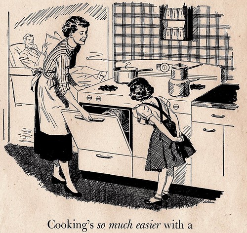
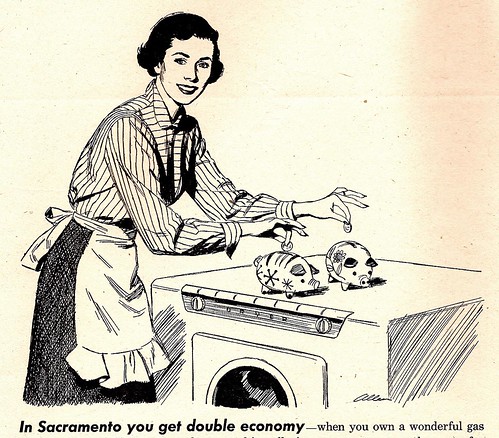
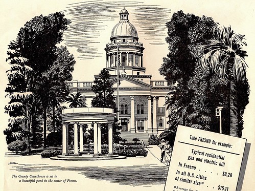
Four scans on this....from monthly PG&E consumer ads in the early 50's, promoting power use and new appliances. (Notice the power prices on a couple of these....WOW!) I enjoyed doing the Fresno Court House scene....almost knew the trees from memory!
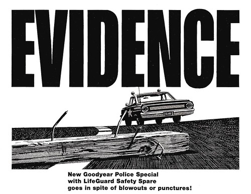
Last scan....in case of doubt about the effectiveness and strength of B&W advertising.....here's....
* To see the full size versions of these illustrations got to Charlie Allen's Flickr set.

5 comments:
Great work Charlie. Now, how many folks can claim to have a B/W portrait of themselves done by the great Charles Allen....lucky me!
Great stuff. I know when I was a kid I had a lot of books from my parents collection that had your work in it. Must have...these just look to familiar to not be.
=s=
Whoaaahh...THAT'S EVIDENT! Man you know how to ink a colourful black & white and how to render trees...
May I just add an observation on the "Evidence" design:
Just had to verify, as a German speaking individual, what "Froschperspektive" means in English - well, it's a worm's eye view.
Now have a look at those crooked nails "puncturing" the horizontal line. The left nail, black in the upper part, white where it contrasts with the dark background asphalt. The right one white, in contrast with that police car's dark shadow side - pointing at that white star.
How much considera(r)tion went into such a design, what compositional planning and oversight, what an EYE behind it all.
Congrats
rich
Amazing shot! This simplicity combined with such perfect angle and rendering makes this illustration a little masterpiece. Thanks for sharing.
Post a Comment